
A mere decade ago, nearly all energy efficiency calculations were presented as annual values. Today, energy is becoming more and more dynamic, and our energy analysis toolkit is changing to match. We’re reaching a nexus where hourly data is available, utility rate schedules increasingly reflect time of day value, and renewables are changing load shapes more and more rapidly.
Hourly analysis has a communication benefit. By leveraging hourly data and rate schedules, we can speak actionably to utility customers. Here’s an example:
On August 2nd, your energy use increased by 100 hp from 4 to 9pm. This spike in energy use is recurring every weekday, leading to a cost increase of at least $200 a week.
This statement clearly states the cost of a change – something that would be hard for a utility customer to parse out otherwise. It also provides very actionable information: the general equipment size (100hp) and when the issue is occurring. Detailed hourly (or even finer) interval data enables actionable feedback like this when paired with analytical tools.
Let’s talk about some of the analytical tools available and how we use them.
Charting average weekly energy use is a great way to begin understanding energy data and trends. Charts, like the one below, visualize general, high-level energy usage trends. This information helps identify shifts in production, operational changes, or times when a building is occupied.
For example, the chart below shows the average daily load profile by day of the week. The chart indicates production or occupancy from 5am to 11pm on weekdays. Weekends appear to be non-operating periods at this facility. However, the facility is still using over 300 kWh/hr when not operating. Estimating 8 cents per kWh for 78 non-operating hours, that’s about $1,900 per week or $97,000 annually. If we could reduce that baseload by 5% this customer would save about $5,000 per year.
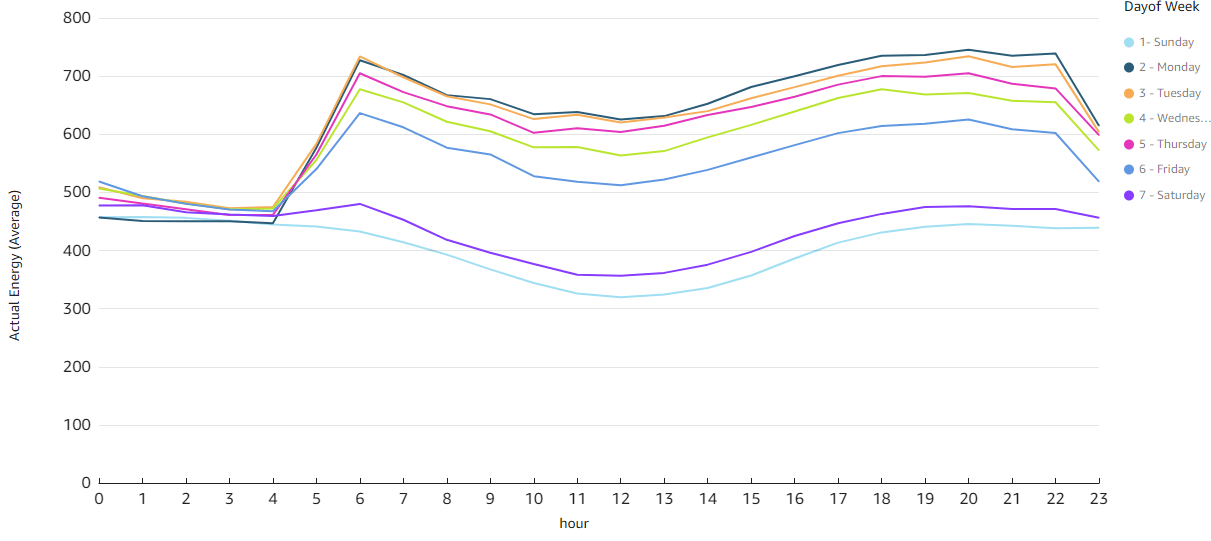
Figure 1: Average daily load profile for each day of week. This chart shows a facility that operates from 5am to 11pm on Weekdays. Weekends appear to be non-operating periods and the facility is still using over 300 kWh/hr when not operating, indicating a potential energy efficiency opportunity. All daily load profiles are smooth as well, indicating there may be potential for load shifting as well.
Including utility schedule information helps define the value of energy to a customer. The figure below shows a weekly load profile. It has been color-coded with orange indicating peak periods and blue for off-peak. This customer’s energy use peaks just before the peak period, but they aren’t currently making any adjustments due to peak periods.
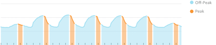
Figure 2: Hourly energy profile for a given week. Normal off-peak rate schedule periods are shown in blue. The orange sections are on-peak. We can see by the shape of the curves that the energy use naturally rises and falls through the day in a gentle curve.
The methods above generally assume the energy profile is consistent over a long period of time or that we are correctly guessing how to segment the dataset (e.g. averaging summer and winter profiles separately for a school). We can take hourly profiles to another level by applying a machine learning technique called clustering.
Clustering takes complex information – like hourly load profiles and total daily energy use – and groups similar days into ‘clusters.’ The figure below shows which cluster each day of the year is grouped into. The plot shows daily energy versus ambient temperature so we can look for opportunities during hot weather. Clusters 4 and 5 are weekend energy use. The remaining clusters are weekday. They group together when plotted as total energy consumption for a day, but they fall into different clusters because the load profiles within each cluster type are different.
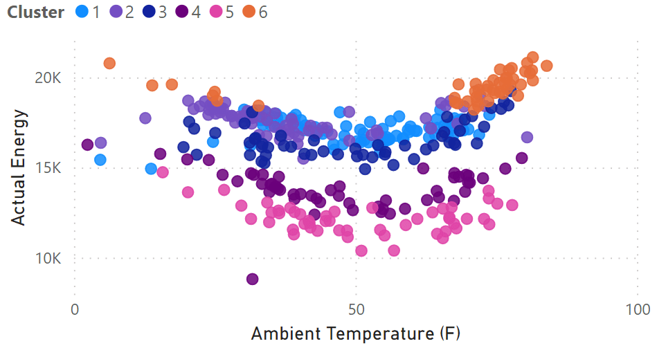
Figure 3: Cluster analysis results for hourly energy data. Each day is assigned to one of the six clusters. Each day is plotted here to show daily energy versus ambient temperature.
Cluster 6 (orange) generally trends with hotter ambient temperatures. We can then plot the hourly profiles for that cluster, and we can see energy increases around 4pm and remains elevated until nearly midnight. If there are summer afternoon/evening grid constraints, we can now talk to the customer specifically about their summer use, the current cost, and the opportunity to shift load or make other changes to reduce their on-peak charges.
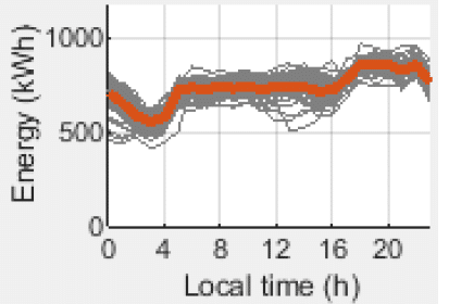
Figure 4: Daily energy profile for higher temperature days (Cluster 6 in previous figure). The orange line is the average energy profile. Each gray line is one of the 70 days contributing to this cluster.
Here’s an interesting example: a client wanted to know how much their customer saved during summer evening peak hours. We employed a daily regression model to calculate their daily energy savings. By adding a cluster analysis, we were able to compare the Pre- and Post-Intervention load profiles, which gave us a percent reduction for each hour of the day. We were then able to estimate the hourly savings value of their efficiency efforts by multiplying the hourly percent reduction by the daily energy savings.
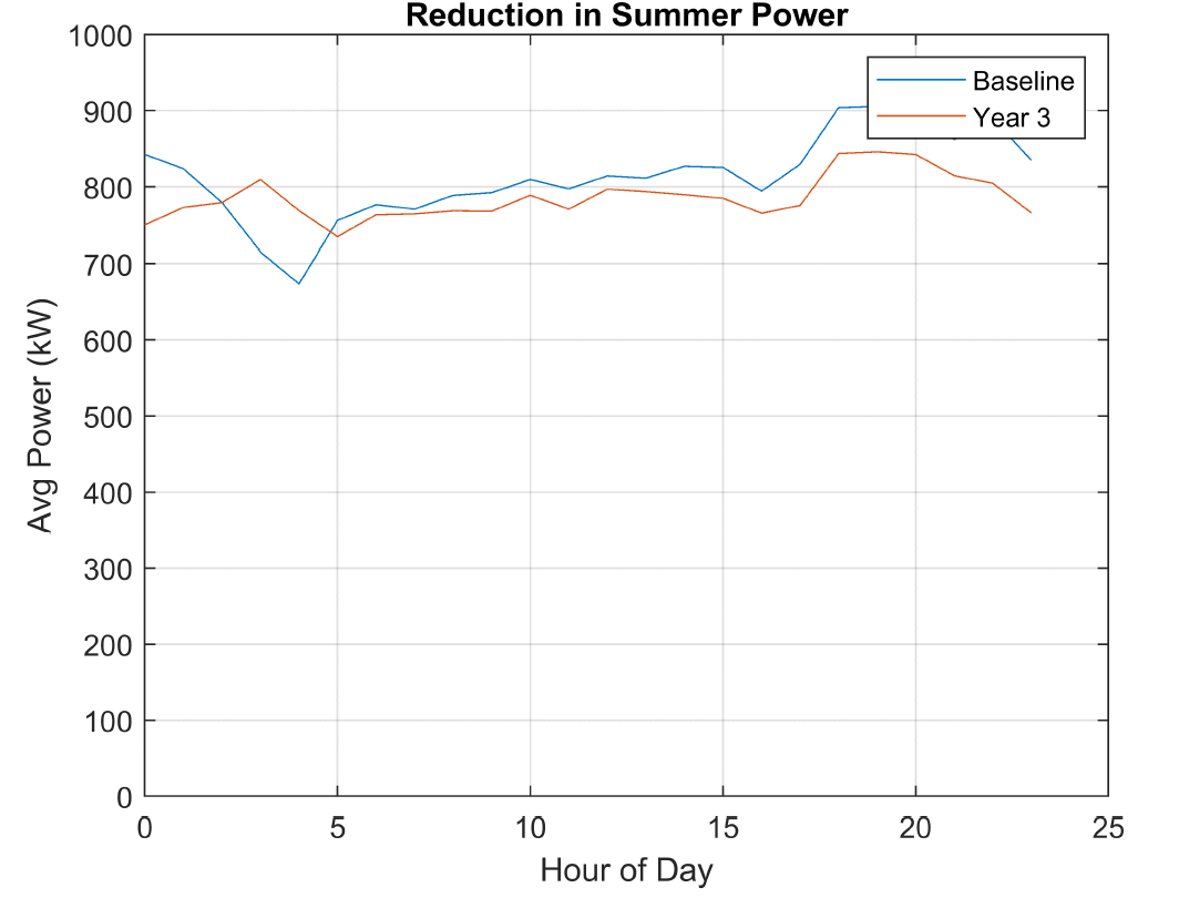
Figure 5: Weekday summer load shapes for the pre-program (baseline) and post-intervention (Year 3) cluster analyses. The difference between the two clusters demonstrates the hour-to-hour change in the participant’s pfile.
Regression models can also be used to create time of week-temperature models. The simplest form of these models assumes a consistent weekly schedule (i.e. the hourly profile for a given week repeats) and that temperature is the only other variable needed to describe energy changes. The model estimates energy use for each hour using a calculated constant for each hour (Ci) and some form of temperature terms (Tj)
kWh/hr = [C1… C168] + b169(T-Ttc)+ + b170(Tth-T)+
The validity of this method and more complex machine learning algorithms has been tested on commercial buildings. Energy Sensei, our energy performance platform, has published test results within the Efficiency Valuation Organization’s (EVO’s) Advanced Measurement and Verification Testing Portal. Our results are on par with the industry’s best, based on coefficient of variation of the root mean square error (CVRMSE) and normalized mean bias error (NMBE).
These are just some of the ways we can use hourly energy data to create utility and utility customer value. There are more advanced techniques, and the field is progressing quickly. We hope this has provided you with some insight into how granular interval data helps us:
Reach out to one of our energy experts to learn more about how you can apply hourly modeling today!